 Nº 01Event
Frontify
HerdezCase study
Herdez “Llevamos la H al Hacer”: an employee wellbeing campaign
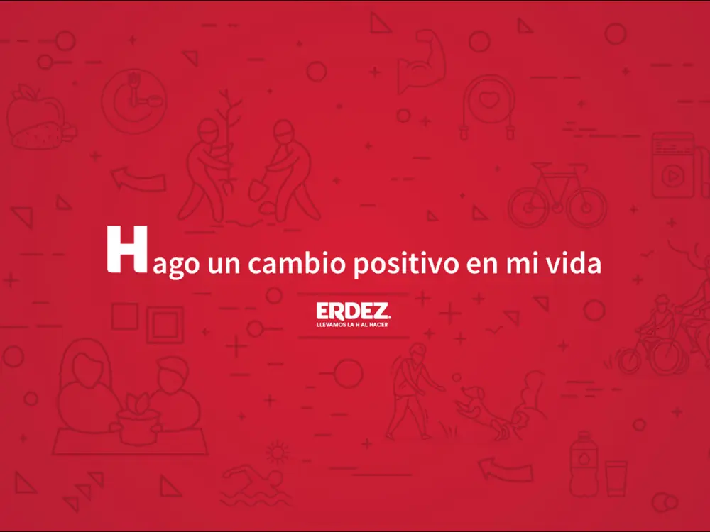
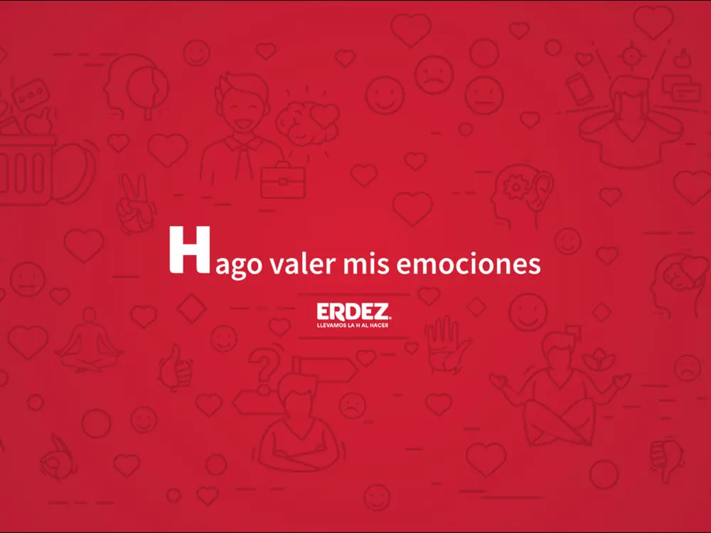
Herdez wanted employees who were empathetic about each other’s workloads and who looked after their mental, physical and financial health. “Llevamos la H al Hacer” (roughly, “we put the H into doing”) turned the brand’s letter into the banner for wellbeing.
- ClientHerdez
- FormatInternal wellbeing campaign
The challenge
The challenge was to have employees who were empathetic about each other’s workloads, with an emphasis on mental, physical and financial health. The communication objective: generate engagement through an effective strategy covering the three areas that affect employee performance.
Wellbeing campaigns tend to trip over fragmentation. Physical, mental and financial health are three different subjects, with different messages, experts and tones, and they usually end up as three disconnected initiatives competing for the team’s attention. On top of that, asking for empathy in the abstract does not work: you need a symbol everyone recognises that puts the whole organisation under the same flag. The challenge was to find that common thread.
The idea
The concept comes from the brand itself: “Nos llevamos la H para hacer, porque a pesar de ser muda, se nota cuando no está... tu salud también” (“We take the H to do, because although it is silent, you notice when it is missing… and the same goes for your health”). The letter that represents Herdez, and that the company is proud of, became part of the efforts to improve employees’ quality of life.
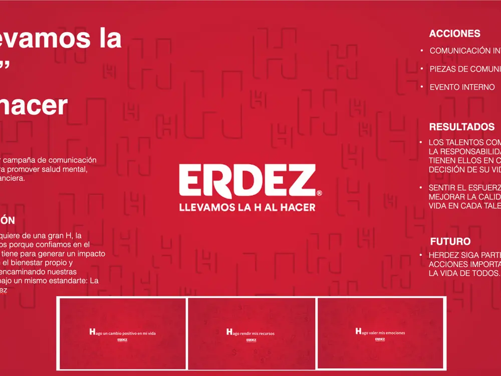
It is a well-rounded idea for several reasons. It uses an asset the team already feels is theirs: the brand’s H. It plays on a grammatical truth, the H is silent in Spanish, to talk about something that also makes no noise until it fails: health. And it solves the fragmentation, because physical, mental and financial health are grouped under one banner. As the campaign puts it, “HACER requiere de una gran H” (“doing requires a big H”), steering actions towards individual and collective wellbeing under the Herdez H.
What we did
- Internal wellbeing communications strategy focused on engagement
- Creative concept “Llevamos la H al Hacer” built on the brand’s H
- Coverage of employees’ physical, mental and financial health
- The Herdez H as the shared banner for wellbeing actions
Key takeaways (expert view)
If your wellbeing campaign has many fronts, group them under a symbol your team already loves, and if it is in your own brand, even better.
01
The best symbol was already in the logo
The Herdez H is a brand asset the team recognises and is proud of. Using it as a wellbeing symbol saves explanations and adds belonging. Any venue or event supplier can do the same: before inventing a new icon, look at which elements of your own brand already carry emotional weight.
02
A pun with substance
“Although it is silent, you notice when it is missing” is wit with content: it describes exactly how health works. Good internal copy does not stop at being funny; it says something true. That mix of humour and truth is what gets a line repeated in the corridors and not just on the intranet.
03
Three subjects under one banner
Physical, mental and financial health could have been three campaigns. Grouping them under a common banner gives coherence and stops the team perceiving a noise of scattered initiatives. For any company, including those in the events industry, the lesson is to simplify the message architecture: one umbrella idea and several subjects beneath it.
More cases
Nº 01Event
Frontify



Happy being just another one?
Let's talk
Tell us what you sell, who to and where it hurts. Within 48 h we'll send you an honest diagnosis and where we'd start.
Get a diagnosis